Remote user testing studies can give you an unparalleled look into the thought processes, behaviors and reactions of real users. Remote user tests can be created quickly, and help teams work through roadblocks and uncover hidden problems early in the development process.
And when used in conjunction with other forms of user research, such as Eye Tracking and predictive analysis, you have powerful tools to make informed, user-centric choices that will greatly benefit your product.
To show the power of these two methods combined, we partnered with EyeQuant to study a popular ecommerce destination, bhphotovideo.com, the website of New York City-based B&H Photo.
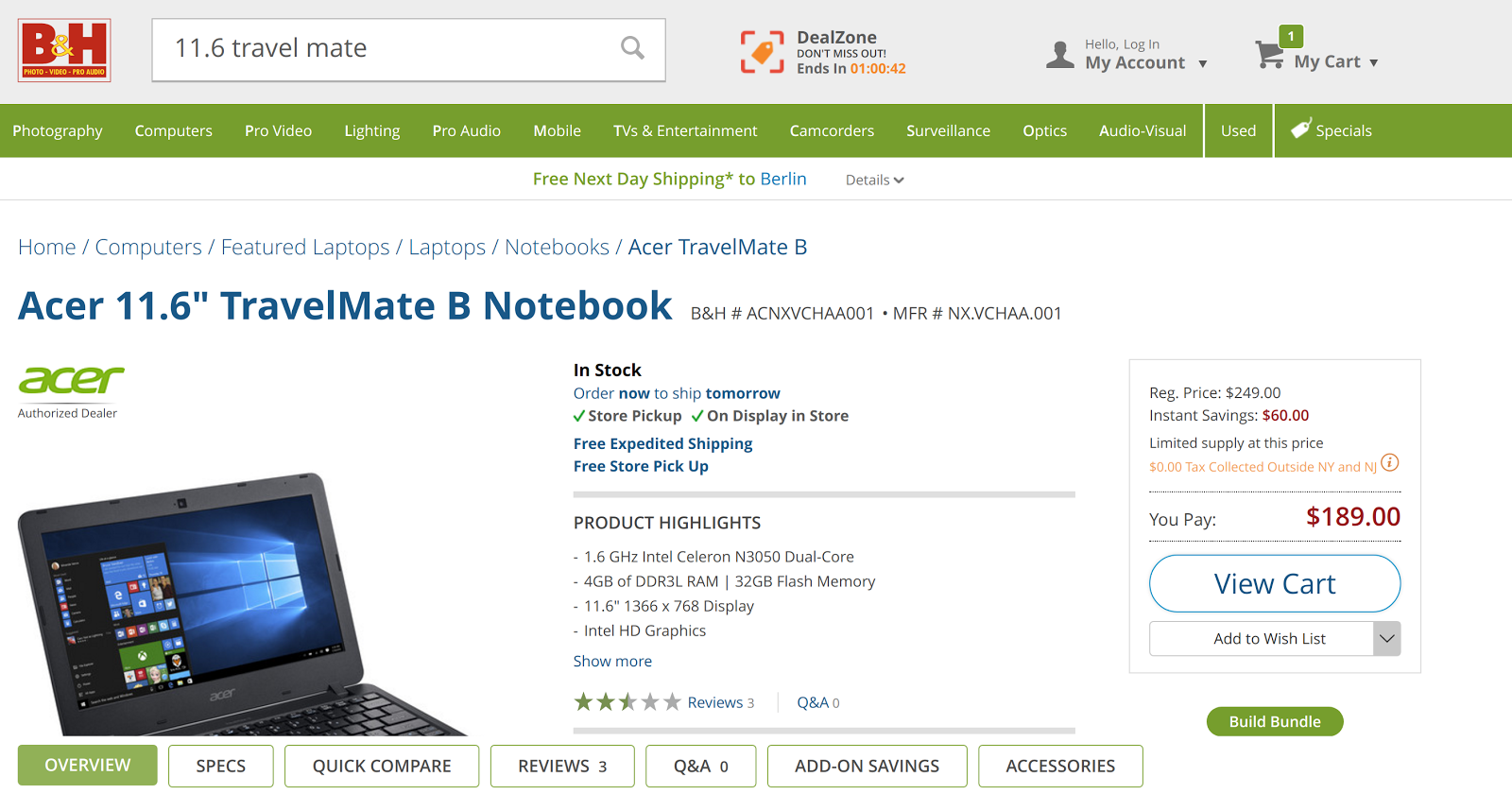
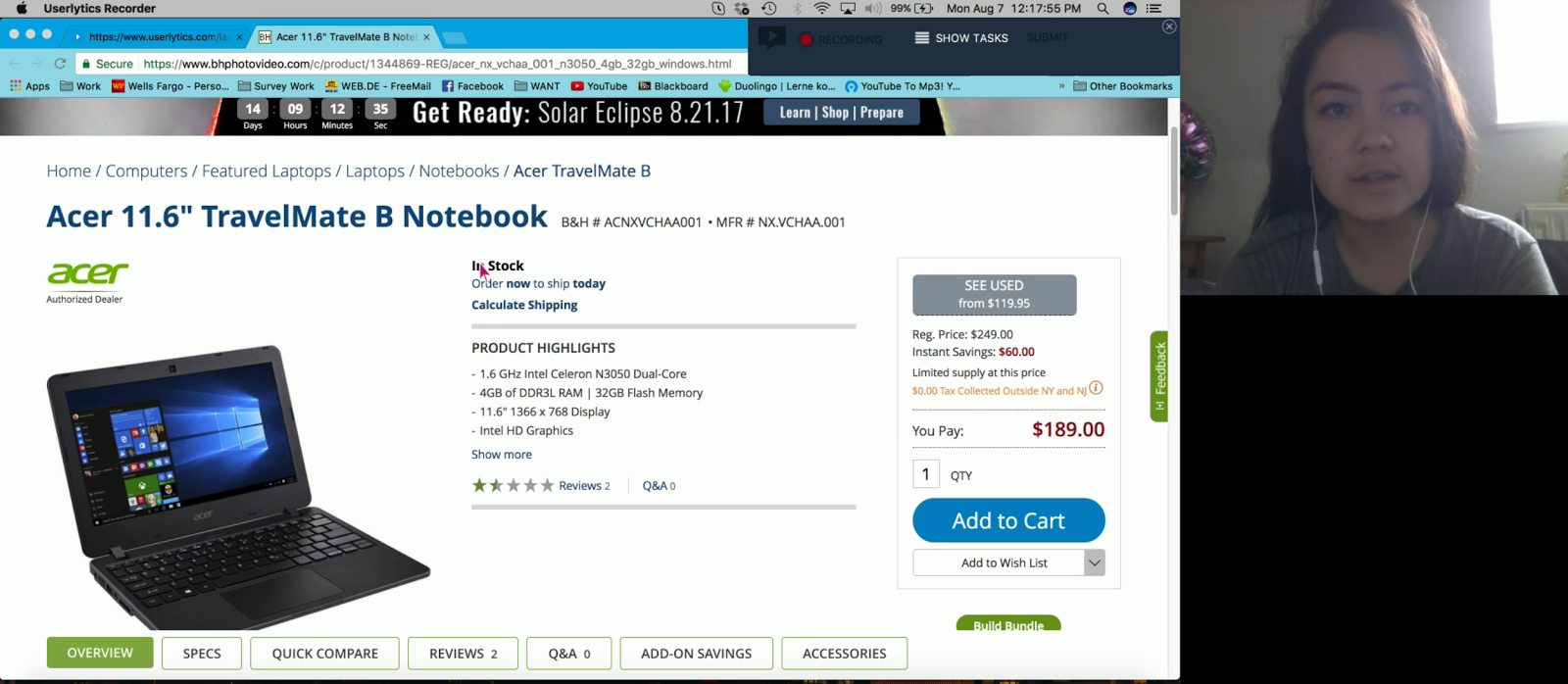
We began by seeing how users interacted with a product page for an Acer laptop. At the same time, EyeQuant used its AI, a predictive analysis engine that tells us what would draw a user’s eye.
Users were asked to give their impressions of the page, and tell us what they noticed first. Most said they initially saw the product’s name or picture. But EyeQuant’s analysis tells a slightly different story. It showed the large banner at the top for the 2017 Solar Eclipse was the most likely to draw attention.
Above, Userlytics user testing showed users noticed the laptop’s image and product name first. But EyeQuant’s analysis showed many users’ eyes would be drawn to the banner ad at top.
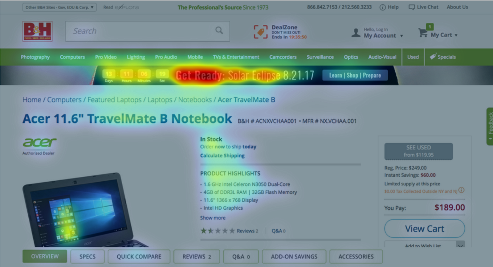
During our testing, when asked about the eclipse banner, most users said they didn’t notice it right away. However, this doesn’t necessarily mean that their eyes weren’t drawn to the banner at all. Rather, they might’ve just skipped it because it wasn’t interesting to them in any way. One participant even said it confused her. The participants weren’t lying about what they saw, but they were being very honest about what they perceived.
The results show, designing an effective banner ad involves more than just getting users to notice it. They have to understand the message the banner is trying to convey. It needs to be relevant, easy to understand and provide a compelling reason to click. B&H’s eclipse banner seems to have been eye-catching, but not particularly effective.
Getting The Whole Picture
During the user testing study, users were also asked what they liked and disliked about the page. One particular standout was the page’s button navigation. Each link takes the user to a specific section of the page: reviews, questions, available accessories.
It’s a feature that EyeQuant’s analysis predicted would get a user’s attention, and our studies showed it was particularly attractive. Most participants said they really appreciated how easy it made navigating the product page, and they liked how quickly they could find the product’s reviews.
Cutting Through The Clutter
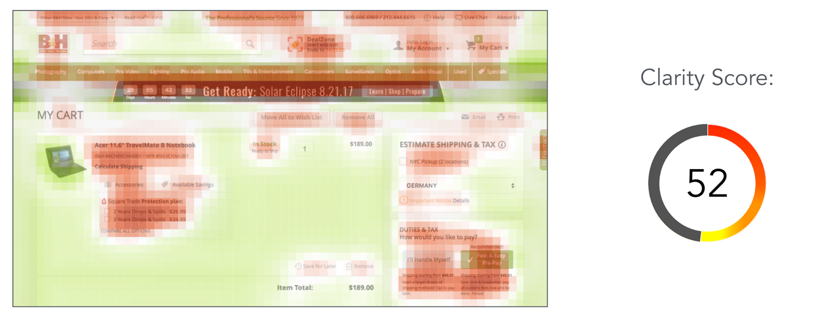
The EyeQuant analysis uncovered another issue we find common on e-commerce sites: cluttered, overly-busy pages that distract users. The above image shows just how much visual noise a user is sifting through during the checkout process.
In Userlytics’ user testing of the same page, it was clear users found the top section distracting. Often without realizing it, they immediately scrolled down to hide the banner and navigation above. The area on the right also proved difficult to understand, causing one participant to re-read the same section several times.
Sites with higher clarity scores - and ones that show consistently better results in our own testing - are visually much cleaner. They do away with the clutter and show only what’s needed: simple navigation, clear transaction information and a prominent call to action.
Companies like Amazon, Etsy and Walmart have worked hard to drastically simplify their checkout flows, to give their customers the easiest possible checkout experience. Through user testing and feedback, those companies are able to make small design and UI changes that have a big impact on their bottom lines.
Key Takeaways